After the Project Showcase, I am quite impressed with the level of all the presentations. From my point of view, all of us made a great effort in the last weeks to improve the pitches and demos. VisualScheduler (1st) and MechanApp (2nd) were the winners of the Spring 2014 CS 460 Project Showcase. Honestly, my personal bet before the event was exactly the same as the final jury's decision. It was obvious that both projects were the best ones, and finally the judges opinion was similar to (I guess) the rest of my classmates.
In my opinion, VisualScheduler is, by far, the most helpful app, because all of us know how difficult is to build your schedule using the current UNM system, so you (and the judges) quickly realized that this application could be really useful for a lot of students, not only at the UNM, but also in other universities along the U.S. Additionally, they gave a very good presentation (as usual), so they deserved the first place, with no discussion. On the other hand, MechanApp also gave a decent presentation, and their application looked very cool, especially in terms of design. Apart from these facts, I think that, in terms on usability, this is the second most useful application, only surpassed by VisualScheduler. I would like to congratulate all the teams, especially the winners. As said before, the level of all the projects and presentations was higher than I expected at the beginning of this course.
Regarding to my team, I believe that we gave a very clean presentation, much better than only a week ago. In this sense, Matt S. and Matt F. did an awesome job, all went as planned. It was worth getting together last Sunday and Monday for walking through the presentation, as well as the practice pitch on Friday and definitely, the feedback provided by Ackley.
Despite not winning any prize, I am very proud of the project I was working on. I believe that we worked very hard along the last months, and I have learnt to use new technologies such as Ruby on Rails. However, the most important thing I may say about this course, is that I was able to work as part of a development team in a country different from I am used to work, which is a priceless experience for me. Thank you to all the classmates, and especially to my teammates!
Wednesday, May 14, 2014
Tuesday, May 13, 2014
The die is cast
The day before the final presentation, we have met again at the Centennial Engineering Center conference room. We wanted to practice one more time the presentation, including the pitch and the demo. This time, we had the slides with all the modifications that Ackley suggested us last Friday.
As we agreed last Sunday, Matt S. will start the pitch, and then, he will pass the baton to Matt F., who will go through the demo. Finally, Matt S. will close the presentation with some conclusions. Therefore, we walked through our pitch&demo three times, and now, I am pretty sure that we are ready to the final presentation.
However, we decided to make some minor changes on both the slides and the pitch. Regarding to the slides, we changed the size of the icons and text on the Maintenance slide, because they were too small, and it was hard to read the titles. On the other hand, we moved the part of the pitch in which Matt S. explained why to cheat when using Demigod does not make sense, "because you are actually hurting yourself". Initially, we had this part in the end, but we decided to move it to the Demigod Users slide, because it seemed a better moment to talk about the honor system.
Additionally, we included a QR code in the handout which redirects users to the website (www.demigod.me) if they read it with a smartphone. We are planning to print out about 50 copies of the handout. It should be enough for the audience we expect on the Project Showcase event.
The die is cast, in just a couple of hours we will have presented our project. Which project will be the winner?
Monday, May 12, 2014
We are (almost) ready...
We decided to get together on Sunday morning to practice the pitch one more time. Fortunately, the Centennial Engineering Center conference room was open, and we were able to practice our pitch in the same place as is going to be held tomorrow. This was really helpful, because we had the opportunity to set up the projector, try the TV's, as well as set an appropriate resolution. It was much easier than I expected, and we had all ready in just a couple of minutes.
As the configuration process went pretty quick, we could focus on the pitch itself. Based on the feedback provided by Professor Ackley on the Friday's optional pitch practice, we previously made some changes both in the slides and in the pitch. We decided to practice three ways of giving the presentation:
While Matt F. and Matt S. practiced the pitch, Natalie and I, acted as judges. I particularly liked the second version, because I saw Matt S. more confident when he spoke about the Demigod's features (maybe because, along the last weeks, he had practiced the pitch more times than Matt F.), whereas Matt F. did a great job explaining the demo, using a natural language, easily understandable by the audience. Additionally, I realized two more things when we followed this version:
- Matt S. can take a rest in the middle of the pitch, and be ready for the second part.
- As Matt F. only explained the demo, he was able to take control over the laptop, showing exactly what he wanted to display. This avoids any lack of coordination between the speaker and the laptop's handler.
Natalie also preferred the second version, so we went again through this way twice, and finally, I felt that we chose the right option. I saw Matt F. slightly more confident, and Matt S., who had brought a bunch of notecards, did not use them any more (which is good, because it gives a better impression to the audience).
The rest of the weekend, we worked on finishing the slides clean up based on the Ackley's feedback (font sizes, colors, slogan, graphics, etc.). Besides, I created a shared folder on Dropbox and several sub-folders in order to add all the project materials. So I included the documentation we have on Google Drive, as well as the story board, the timeline, and the full commit log.
This evening, we are going to practice one more time trying to debug some minor things on the pitch, but I am absolutely convinced that our presentation will go well tomorrow.
As the configuration process went pretty quick, we could focus on the pitch itself. Based on the feedback provided by Professor Ackley on the Friday's optional pitch practice, we previously made some changes both in the slides and in the pitch. We decided to practice three ways of giving the presentation:
- Matt F. (Intro), Matt S. (Demo and some slides), Matt F. (Last slides after the demo)
- Matt S. (Intro), Matt F. (Demo), Matt S. (Last slides after the demo)
- Matt S. (full presentation)
While Matt F. and Matt S. practiced the pitch, Natalie and I, acted as judges. I particularly liked the second version, because I saw Matt S. more confident when he spoke about the Demigod's features (maybe because, along the last weeks, he had practiced the pitch more times than Matt F.), whereas Matt F. did a great job explaining the demo, using a natural language, easily understandable by the audience. Additionally, I realized two more things when we followed this version:
- Matt S. can take a rest in the middle of the pitch, and be ready for the second part.
- As Matt F. only explained the demo, he was able to take control over the laptop, showing exactly what he wanted to display. This avoids any lack of coordination between the speaker and the laptop's handler.
Natalie also preferred the second version, so we went again through this way twice, and finally, I felt that we chose the right option. I saw Matt F. slightly more confident, and Matt S., who had brought a bunch of notecards, did not use them any more (which is good, because it gives a better impression to the audience).
The rest of the weekend, we worked on finishing the slides clean up based on the Ackley's feedback (font sizes, colors, slogan, graphics, etc.). Besides, I created a shared folder on Dropbox and several sub-folders in order to add all the project materials. So I included the documentation we have on Google Drive, as well as the story board, the timeline, and the full commit log.
This evening, we are going to practice one more time trying to debug some minor things on the pitch, but I am absolutely convinced that our presentation will go well tomorrow.
Saturday, May 10, 2014
Optional pitch practice
Despite not being required and not having any direct impact on our grade, we decided to take part into the optional pitch practice proposed by Ackley in the last lecture of this course. In this sense, we considered that we could improve our pitch in somehow, and having direct feedback from Professor Ackley would be one of the easiest ways to get it.
We based our pitch on the model that we cleaned up during our last team meeting. From my point of view, this time the demo slides flew better than other presentations in class, and Matt. S. spoke calmer and more confident. Anyway, Professor Ackley give us useful feedback on the presentation and the demo:
Presentation reactions:
- Slightly long (1 minute over the scheduled time)
- Set up issues (again). We need to get everything setup before the presentation, and we should keep the VGA cable unplugged until all is ready.
- Hide the left sidebar (Ubuntu) when displaying the demo.
- We have to think about a "catchy" slogan to display at least on the first and the last slide (Ackley suggested: "Help you become a better you").
- Mention in some point of the presentation the fact of cheating is in fact "hurting yourself". So, this game does not make sense if users cheat.
- Introduction & facts: match rankings and speech.
- Our slides look "too academic". We need a new theme with bigger fonts (more striking).
- Remove the "Demonstration" slide. Just show the demo.
- Change the title of Sustainability slide to something more informal like “Keeping the lights on”.
- Be sure to mention in the Competition slide that Demigod "puts everything together for free".
- Some minor changes regarding to the slides order.
- He liked the technology choice justification.
- He do not like the lack of email confirmation when a new user sign up.
- Change the name of the non-logged page (first page that user see when enter the website) from "marketing page" to "Home page" or something similar.
- He also do not like the fact of starting the demo by showing how to create a custom challenge. Move this example later, and emphasize on the Demigod's flexibility and customization.
- Choose a challenge (as an example) that you can really do. For example, ride your bicycle twice a week, and say something like "I have ridden my bicycle to come here".
- Consistence on text capitalization. There are several inconsistencies especially on the home page.
- Close the presentation with the slogan and the URL. We need to cause impact on the audience.
Now, I believe that we are ready to the project showcase which is going to be held next Tuesday. Cross our fingers, and go ahead!
Wednesday, May 7, 2014
What is the connection between Computer Science and Software Engineering?
We discussed about this question last Monday in our last lecture. In fact, the real question was a quote from Steve Jobs: "Real programmers ship code". From my point of view, this course brings you the opportunity to apply all your previous knowledge to a particular project, which is actually a clear connection between CS and SW Engineering.
I think that this happens continuously when you face a new project, like decide when is better to use certain resources (even little things that, apparently, should not have too much impact on the project). I think SW Engineering implies something beyond programming, efficiency or performance. In this sense, "new" terms like deadline, schedule, compromise, customer, stakeholder, task, etc. arise when you deal with a real project.
I agree with the way that Ackley talked to establish the difference between CS and SW Engineering. He said that CS is about "building ideas", and SW Engineering is "take these ideas and apply them to specific cases" (i.e., "building stuff"). It is clear that there exists a connection between both disciplines, and I believe we can say that CS makes no sense without SW Engineering, and vice versa.
I think that this course is especially useful to realize why you took other previous CS courses, because you have to use all your knowledge, applying the best of your skills and experience for the good of your team.
Last, but not least, working successfully as part of a team is also a key part of this course (and in the real life), because Software Engineering does not only mean engineering. This is very important for output quality, talent, and communication.
Monday, May 5, 2014
Another profitable team meeting
Our team had a meeting this Sunday. We spent almost 4 hours going through all the stuff that needed to be done. It was actually a kind of coordination sessions, and we finally accomplished several things:
- We worked on the slides, which are now ready for the final pitch. In fact, we are going to have a last practice pitch next Friday at Ackley's office. I think this will provide us a very useful feedback.
- Natalie updated the code that determines the duration of a day and a week, because we had been assuming that a day was 20 seconds (for testing purposes).
- I finished the Frequent Asked Questions page
- I added links to the FAQ page and Contact form both from the homepage and profile page.
- I made some changes in the contact form. Concretely, I became some critical variables (Gmail account and password) in the application.rb file from plain text, to environment variables. We still have to test them, because we were not able to make it work properly.
- Natalie and Matt S. fixed several important bugs regarding to the check-in and abandon challenge buttons.
- Matt F. created a Google document with the headlines of the speech we are planning to make.
- We also made a practice pitch with the updated slides and the new demo. It seems that it is going to be better than the previous ones.
This week, we will work basically on running some test, trying to find bugs before the final demo. Additionally, we have to prepare the final group turn-in, which is due to the next day of the final project showcase.
Saturday, May 3, 2014
Contact form
In the last team meeting, I proposed to create a contact form to enable users a way to contact us directly if they have any question or problem that needs support. After a quick research on the Internet, I found some information about how to create forms in Rails, so I got to work...
First, I created a new Gmail account for Demigod, because I did not really have any contact email so far. Having the account, I started working on Rails by configuring the email parameters in the application.rb file:
config.action_mailer.smtp_settings = {
:address => "smtp.gmail.com",
:port => 587,
:domain => "demigod.me",
:user_name => "new_account@gmail.com",
:password => "************",
:authentication => :plain,
:enable_starttls_auto => true
}
config.action_mailer.default_url_options = {
:host => "demigod.me"
}
Then, I created the message model file (message.rb), as well as the mailer model (/mailers/notifications_mailer.rb) and views. So I add the files /views/notifications_mailer/new_message.text.erb (for message layout):
Name: <%= @message.name %>
Email: <%= @message.email %>
Subject: <%= @message.subject %>
Body: <%= @message.body %>
Besides, I generated the controller file (app/controllers/contact_controller.rb), and I added the two required actions (new and create):
class ContactController < ApplicationController
def new
@message = Message.new
end
def create
@message = Message.new(params[:message])
if @message.valid?
NotificationsMailer.new_message(@message).deliver
redirect_to(root_path, :notice => "Your message was successfully sent")
else
flash.now.alert = "Error: Please fill all the fields"
render :new
end
end
end
Then, I created a new Haml view file to display the form itself. I focused on the functionality rather than on the design, because I first wanted to check if it worked properly. Finally, I added the corresponding routes (GET and POST) in the routes file to make sure about the previous actions worked. I set the URL /contact to get access from the website:
match 'contact' => 'contact#new', :as => 'contact', :via => :get
match 'contact' => 'contact#create', :via => :post
I tested the new form with several examples and, fortunately, I received correctly all the emails sent through the new contact form. In the coming days, I will work on the design of the contact form, but I want to run more tests before going further. Additionally, I would like to figure out how to hide the email account and especially the password from the configuration file, because it is clear that, in terms of security, this is a huge vulnerability for our website.
Wednesday, April 30, 2014
Practice pitches. Second round (III)
The second round of practice pitches has completed last Monday. This time, it was the turn of Automaton, VisualScheduler, and G.E.R.A. I am going to discribe their pitches and my reactions, as well as the reactions from others in class (classmates and Professor Ackley):
- AUTOMATON
- GLOBAL EMISSIONS REDUCTION ALLIANCE (G.E.R.A.)
- AUTOMATON
- They used 3 speakers again. I think they should cut it to 2.
- Good introduction, the slides flew smoothly...
- Basics of Automaton. From my point of view, the best improvement, because this time, the explanation about how the game works was much more accurate than in the first presentation. The slide they used to this part of the pitch was very clear.
- Live demo. Several examples (much better than the first round) and test, from the simplest to hardest ones.
- They had time enough to complete the pitch (1 minute before the time limit). In this sense, a classmate suggested speaking a little bit slower.
- Other classmate proposed comparing Automaton with other applications (if any).
- Ackley suggested not to read from hand cards when speaking, and avoid using pronouns to refer teammates (use their names instead, much more professional).
- VISUALSCHEDULER
- This time, they focused on comparing their application with the old method used on the UNM.
- Good coordination in general, the slides flew well.
- They also explained how they will generate revenue of the project.
- Spreading the world: Basically Facebook and Twitter, fair enough in my opinion.
- Live demo: Some minor problems when trying to show an example. Anyway, they clearly explained how the schedule builder worked. They went through a real case for the next semester. Nice demo.
- The schedule generator is going to be a premium feature ($5/month)
- The website will be available on October.
- Their pitch fitted with the available time.
- A classmate suggested trying the application with volunteer students. Good point!
- Ackley liked the schedule generator and the presentation itself. I also believed that their second pitch was slightly better than the previous one.
- GLOBAL EMISSIONS REDUCTION ALLIANCE (G.E.R.A.)
- They changed the dark background on the handout. Much more legible this time.
- The problem: They used the Goldilocks Method to justify the creation of their app.
- Similar apps: Again, they went through two kinds of applications ("Pure game based" and "Pure data entry"), explaining their pros and cons. Then, they showed the advantages of Demigod, which gathers all of both approaches in the same app (Goldilocks).
- Approach: "A gamified of carbon emissions tracking" (good definition). It uses real data and it is focused on the real world impact by engaging stories or missions. Thanks to these missions, users can win spendable points as well as unlock badges.
- Live demo: The first time an user logs in, a "step by step" tutorial is displayed (I liked it!). They showed how the missions worked, and how users could create their own missions. In general, the demo was OK.
- Unfortunately, Ben forgot part of the pitch in the middle of the presentation. But this kind of things usually happens.
- Ackley told them that they spent 5 minutes on the introduction. I agree, in fact, I think they should cut some time from the comparison between G.E.R.A. and other apps.
- I particularly liked the statistics page (nice charts).
Monday, April 28, 2014
Last team meeting
Yesterday morning, we met together in order to start preparing the final presentation. We checked again the classmate's feedback of our last practice pitch (both from the question time and some blog posts), as well as Professor Ackley comments.
In my last post, I wrote about our weaknesses during the last practice pitch. Our main goal was to fix all these things, trying to improve the slides in some way. Therefore, we spent two hours redesigning the slides by:
In my last post, I wrote about our weaknesses during the last practice pitch. Our main goal was to fix all these things, trying to improve the slides in some way. Therefore, we spent two hours redesigning the slides by:
- Removing several facts and statistics (a cleaner design means easier to follow for the audience).
- Adding three new slides corresponding to each one of the stages of a Harvard study for changing to a healthy behavior (Preparation, Action and Maintenance).
- Removing the technology choices slide. Instead, Matt S. will talk about it during the demo.
- Searching other applications and websites that provide similar services as Demigod.
- Based on the previous research, creating a slide named as "The Competition" in which we compare and contrast Demigod with other apps. We would like to justify the creation of our application, and the Goldilocks Method should be the easiest way.
Additionally, we made some changes on the footer of the website to adapt its size to the mobile version. Besides, we removed three small rounded buttons that we initially add to eventually link whatever we need, but finally we did not find anything to link, so we decided to cut them out.
As we had a lot of interesting stuff in our presentation slides, I suggested to use it in order to create a new Frequently Asked Question page in the website. This page will include different paragraphs with commonly asked questions and information about our website, so we will use some data from the slides, but we will have to add new things to complete the page (I created a new Google doc shared with all the team members, so that now we all are able to add new stuff.)
On the other hand, I also proposed creating a new Contact section. Basically a simple form to provide users a way to contact us directly if they have any question or problem that needs support. In this sense, I think that put an email address instead of a form is obviously much simpler, but this may lead in spam issues. So if we have time enough, we will create this new section.
Saturday, April 26, 2014
Practice pitches. Second round (II): Demigod
It is time to evaluate ourselves. This week we had a second chance to show our project to the rest of the class, and practice the final presentation, which is going to be held next May, 13.
We prepared a new handout, much more simple, and including just a couple of keywords. This was one of the task I did last week, and I am think that the new design is much better than the first handout version. However, I made a grammatical mistake when writing the text on the handout: "Improve your health, fitness, and nutrition through challenges that help you build heathly habits and create the lifestyle you want"
A classmate noticed that there was a mistake on the text, and he told as where it was. So, I fixed the error (heathly" to "healthy) just after the Monday's class. I think it is always good to accept your own errors, and the handout was my responsibility.
Apart from the handout mistake, these are my reactions on the pitch itself:
- Matt S. spoke more fluent in general, but we still had too many facts in the first part of the pitch. We definitely have to cut down the number of facts and references about the current state of America.
- Despite testing the slides on Matt F's laptop before the pitch, we had problems (again) with the screen resolution.
- The demo was more interesting in general, because we change from a prerecorded video to a live demo.
- On the demo, we made another relevant mistake when Matt F. tried to login via Facebook using his account, and it did not work (his account was blocked). We should have tested it prior to the demo. Anyway, next time we are going to use my account, or the one of Natalie.
- We should deal somehow with the potential cheating made by the users.
Reactions from classmates and Professor Ackley:
- A classmate suggested speaking a little bit more about the intellectual challenges, because we talked too much about the nutritional/physical challenges (tons of studies and references about the body, nutrition, etc.)
- Ackley said that we spent a lot of time in the first slide.
- Compare our application with the competence. It could lead to the use of Goldilocks Method, which may be interesting in my opinion.
- Avoid using the "Our solution" slide.
- Hide Ubuntu's sidebar when displaying the slides (i.e., use fullscreen mode).
- Use short challenges on the demo, for example, a challenge that needs only 1 check-in along 1 week. This would allow us to show how a success challenge looks like.
Based on the mistakes we made, and especially on the feedback we got, we will try to prepare the final pitch. Only 15 days left...
Wednesday, April 23, 2014
Practice pitches. Second round (I)
Last Monday, we had another opportunity to show our project to the rest of the class and practice the final presentation, which will be held in just a couple of weeks. However, on this post, I would like to focus on the other two teams, leaving our own pitch comments to my next entry (maybe next Friday or Saturday).
So, these are my reactions and comments to second round of practice pitches (MechanApp and Powderade):
- MECHANAPP
So, these are my reactions and comments to second round of practice pitches (MechanApp and Powderade):
- MECHANAPP
- Again, a clear, clean and solid presentation. No major mistakes in general. I think they did the best pitch so far.
- They cut the number of speakers to 2 (there were 3 last time)
- The handout was pretty similar to the one of the first practice pitch (but it is good!)
- They started the pitch introducing themselves, and then, they went through a brief introduction, main goals of the app, and a justification (Why MechanApp? -> Basically do it yourself, saving money and improving your auto mechanical skills).
- Business model -> revenue: targeted advertising
- The demo was again very good, perfect execution, slightly better than the first pitch. They chose a specific car, model, and year in order to give an example. The app guides you through different possible workarounds. This system reminded me to the Troubleshooting problems system of Windows.
- Awesome design. I believe it is actually the strongest point of this project.
- They also explained how the Greedy algorithm worked by showing a tree structure and using other real example at the same time. Key-point of the app: It statistically learns from previous problems, and intelligently selects most likely causes for the selected vehicle first to investigate.
- Major changes in the way they organized the pitch.
- This time, they only used the video to show the demo (much better!)
- The handout was not bad, but I believe that they can easily improve it (they should reduce the amount of text).
- They started comparing Powderade with other existing skiing and snowboarding apps such as Snocru (Goldilocks method).
- They talked about the different achievements (speed, GPS stuff, distance, etc.).
- They also mentioned a Facebook sharing feature, which will be available coming soon. In my opinion, they should not have said nothing about it...
- They made an important mistake when tried to play the demo video using Youtube (the movie did not load). Fortunately, they finally managed to play it, but it would be interesting to play a local copy of the video instead. Anyway, the video was focused only on the demo itself. It was OK, but I believe that they included images recorded with an on-board camera along too much time. In my opinion, these kind of images distracts the audience's attention, and besides, they do not match with the information they display in the demo.
- Technology choice justification was OK in general. However, Ackley suggested moving all the Technology choice stuff before playing the video (demo). I agree.
- The application will be available on Google Play for the next winter season.
- A classmate suggested (again) that the name of the app is quite similar to "Powerade" (the sports drink). It could be overlooked by the team, but in terms of marketing may be a trouble to promote the product, especially in online search engines. Anyway, I think it is too late to change the app's name...
Monday, April 21, 2014
Creating static pages on Rails
Recently, I had to create three new pages for Demigod's website. These pages had a common characteristic, because all of them were based on static content (i.e., no data or information collected from a database, user input, etc.). So, I needed three pages to write a description of one each of the categories that we use to classify our challenges (Nutritional, Physical, and Intellectual).
class HomeController < ApplicationController
(...)
def nutritional
end
def physical
end
def intellectual
end
end
I started creating three separate actions in the home controller (/app/controllers/home_controller.rb):
class HomeController < ApplicationController
(...)
def nutritional
end
def physical
end
def intellectual
end
end
Then, I added the corresponding routes for each one of the actions (/config/routes.rb):
get "/nutritional", to: "home#nutritional", as: "nutritional"
get "/physical", to: "home#physical", as: "physical"
get "/intellectual", to: "home#intellectual", as: "intellectual"
Finally, I generated three new views to display the content itself (app/views/home/category_x.html.haml). I wrote the static content (in this case, just text and a linked button above the text to the sign up form) using Haml, which is quite similar to HTML. In fact, the easiest way from my point of view is to write HTML code and use an online converter to get the Haml code.
After that, I was able to easily add links to the the new pages from the homepage (/app/views/home/index.html.haml), for example, this portion of code corresponds to the Nutritional link in the homepage:
(...)
%p
= image_tag("nutritional_icon.jpg")
%h3{style: "text-align: center;"}
%a{href: "nutritional"}
Nutritional
%p{style: "text-align: justify;"}
Keep your body healthy and follow a better diet thanks to several interesting challenges...
#more-btn
%a.btn{href: "nutritional"}
more
Saturday, April 19, 2014
Eighth client meeting reactions
Less than a month to finish the Spring semester, so we have just a couple of weeks to complete our project. The last client meeting took place last Wednesday with Nikan. We basically focused this meeting on the demo, which covered the following topics:
- Homepage. New module with links/icons to categories descriptions.
- Three new static pages with full descriptions of each category (Nutritional, Physical and Intellectual).
- Profile page: New design features (icons, progress bar, stats simulation, Facebook progress sharing button, etc.). Now, the progress bar color fits with the color pattern.
- Challenges page. Design (color pattern), new popup with information about the selected challenge (design).
- "My Challenges" section. New label system and "Finished challenges" feature.
- Check-in: The number of check-ins you have already done, as well as the current week are now shown when you check-in (Good job Natalie!)
- Mobile version: some improvements regarding the functionality.
Nikan's reactions and questions:
- The default avatar picture was Ok, but she thought that it should be smaller, because its size was, for example, much bigger than the Demigod's main logo. This did not happen in the mobile version.
- She liked our mobile version: "It is a positive point of your project".
- Nikan also asked about the performance of our application. Matt S. was working hard to improve it, and now, the website runs faster.
- She asked about the sorting criteria to show the challenges list (it is random so far).
- Nikan suggested to add a challenge description into the progress bar (as a reminder of what you have to do).
Next action:
- Prepare the second practice pitch.
- Progress page
- Descriptions for all the challenges
- Beta tests (family & friends)
- Looking for bugs and fix them (if any)
- Start thinking about marketing...
Wednesday, April 16, 2014
Ubuntu on Virtualbox. Screen resolution optimization
As I explained in one of my first post about the CS 460 project, I was running Ruby on Rails a virtualized instance of Ubuntu 12.04 LTS x86 using VirtualBox. Matt S. recommended me to use Linux instead of Windows because the ROR installation was much easier, apart from the fact that all this software is free.
I have been working along more than two months with ROR on Ubuntu, especially focused on the functionality of the application. However, a problem came up when we moved to the design, because my virtual machine could only be set-up to a resolution of 1024 x 768 px., which was not good in terms of design tasks. For this reason, I had to figure out a way to improve the screen resolution of my Ubuntu installation, and I finally got it after a research on some Internet forums.
In fact, there exists a resource to easily get better graphic performance, which is named "Virtualbox Guest Additions". By default, VirtualBox provides graphics support through custom virtual graphics The Guest Additions is a package available for Windows, Linux, Solaris, OpenSolaris and OS/2 that includes a special video driver for increasing video performance and also includes additional features, such as automatically adjusting the guest resolution when resizing the VirtualBox window or selecting fullscreen mode.
The installation is quite easy. In Ubuntu, open a terminal and run:
> sudo apt-get update
> sudo apt-get upgrade
> sudo apt-get install dkms
Then, you have to reboot your guest system in order to activate the updates. Again, open a terminal and run:
> sudo apt-get install virtualbox-guest-additions-iso
Once I installed the VirtualBox Guest Additions, I rebooted the Virtual Machine and selected "Auto-resize guest display" on the "View" menu. This allowed to see an optimal resolution depending on your screen (anyway, higher than 1024 x 768 px.). Thanks to this package, now I am able to work with the Demigod's design properly; even use my laptop to display demos in client meetings.
Monday, April 14, 2014
Practice pitches. First round
Today, the last three teams have showed their projects to the rest of the class. We presented our project the past week, because the fact of being volunteer for the first round of pitches seemed as a "professionalism" point. However, from my point of view, it is a significant advantage for the rest of the teams, because they saw other pitches before they prepare one. So, they realized the most common mistakes, the strongest points, the professor remarks, etc., and they could take into account all of them when you face your own practice pitch.
Anyway, these are my reactions to the three projects presented today:
- AUTOMATON
- VISUALSCHEDULER
Anyway, these are my reactions to the three projects presented today:
- AUTOMATON
- 3 speakers in total. I think they should cut it to 1 or 2.
- The handout was OK. Colorful and just a couple of words.
- Good description and goals.
- The demo was good in general (maybe slightly long).
- It seems like people did not understand how the game exactly worked.
- They should probably add a detailed legend, and accurate explanations about the rules (tooltips).
- Nice design, especially dialog windows when success, stats and game selection (UX).
- They may consider hiding advanced options in the earliest levels.
- They did not stop the demo while they were answering questions. This may distract the audience's attention.
- Game already available on the Internet (good point!)
- VISUALSCHEDULER
- Good intro and problem definition
- They are focusing on the UNM current schedule system, but this system may be exported to other universities.
- The demo was OK, but they didn't handle the time properly because they finished their pitch 3 minutes before the minimum time (7 minutes). This produced an awkward silence...They finally improvised an example, but it looked like something unprofessional.
- The application seemed very useful for students. Some classmates suggested splitting the calendar and the search parts in a different way in order to be more clear for the user (now, they are using tabs).
- Too much text in the handout
- User accounts (save and edit schedules), to be implemented. They should try to do it as soon as possible because it is an important feature.
- It is going to be free, with premium accounts ($3/semester) that allow user to use some options like waitlists, etc.
- A classmate proposed the possibility of having records of previous semesters (like a user history). It sounds good in my opinion.
- GLOBAL EMISSIONS REDUCTION ALLIANCE (G.E.R.A.)
- Handout: too dark background color.
- They justified the creation of this app by using the Goldilocks Method. Initially, they set the problem, and then they said that nowadays there exists basically two kinds of applications related to global emissions: games and user-data based. G.E.R.A. is combines these two worlds in just one app.
- Goals well defined. They want to encourage users to help the environment in some way by taking part in different missions.
- The demo itself was good, but they made a relevant mistake when they chose the background for the website (too dark in my opinion, mostly because they chose a slightly "apocalyptic" picture as background).
- The rest of the color pattern for the website did not help to improve the contrast. This fact was noticed by several classmates.
- They are planning to implement a Facebook sharing feature in the future (I believe they should include it in the first release if they have time enough).
- A classmate suggested not to use too many notes (small cards in this case) in the pitch.
Saturday, April 12, 2014
Seventh client meeting reactions
Last Wednesday, our team had the seventh client meeting with Professor Ackley. As we were working on the practice pitch, this week we were not able to do as many improvements as we desired. Ackley asked us about the performance of the website, and Matt S. answered that we made some minor improvements and there are not important issues so far in terms of performance. Then, we started the meeting showing a demo with the last features by request of Ackley, who wanted to see a kind of "tour" through the Demigod's website.
Demo and client reactions:
- Homepage (Ackley asked about the reason for include a Greek soldier silhouette)
- Mobile version (especially the auto-resize feature that adapts the resolution to any device. It was one of the things Ackley liked the most)
- Signing up (Facebook and "standard" way)
- Profile page (stats, bars, levels, etc.). Ackley suggested making the levels more colorful and create challenges related to the website functionality, such as complete your first challenge or upload a new avatar picture (I believe this was a great idea!)
- Challenges page (random list of ten challenges by category. It includes a "View all" button to show the full challenge list). Ackley told us that we could show the most taken challenges instead of a random list (I agree). He also suggested adding a description of the challenge in the progress bar (like a reminder). This page needs more design.
- Share on Facebook (successful challenges and current progress)
- Check-in (it included the confirmation popup when you check-in). Ackley proposed adding on the confirmation popup the number of check-ins you have already done (Good idea as well).
- Failed check-ins (how it works). Ackley asked us several things:
- Regarding the stats, Ackley recommended keeping Altruism and Diet, and get rid of Dexterity and Willpower.
- He also suggested looking for test users shortly (friends, family, etc.), because we have to get some feedback.
Next action:
- Challenges page design
- Profile page design and stats progress bars functionality
- First user tests (by the next two weeks)
Demo and client reactions:
- Homepage (Ackley asked about the reason for include a Greek soldier silhouette)
- Mobile version (especially the auto-resize feature that adapts the resolution to any device. It was one of the things Ackley liked the most)
- Signing up (Facebook and "standard" way)
- Profile page (stats, bars, levels, etc.). Ackley suggested making the levels more colorful and create challenges related to the website functionality, such as complete your first challenge or upload a new avatar picture (I believe this was a great idea!)
- Challenges page (random list of ten challenges by category. It includes a "View all" button to show the full challenge list). Ackley told us that we could show the most taken challenges instead of a random list (I agree). He also suggested adding a description of the challenge in the progress bar (like a reminder). This page needs more design.
- Share on Facebook (successful challenges and current progress)
- Check-in (it included the confirmation popup when you check-in). Ackley proposed adding on the confirmation popup the number of check-ins you have already done (Good idea as well).
- Failed check-ins (how it works). Ackley asked us several things:
- What was the relation between check-ins and weeks? and
- Can a user check-in more than once a day? (this is not allowed, because the website has been designed to accept a maximum of one check-in a day)
- Is there something that tells users when they success a full week? Now, once the users complete all the check-ins of the current week, they basically can not check-in again until the next week. It should be interesting to show a message like "You have already completed your X check-ins this week. Come back the next week!" (totally agree)
- Regarding the stats, Ackley recommended keeping Altruism and Diet, and get rid of Dexterity and Willpower.
- He also suggested looking for test users shortly (friends, family, etc.), because we have to get some feedback.
Next action:
- Challenges page design
- Profile page design and stats progress bars functionality
- First user tests (by the next two weeks)
Wednesday, April 9, 2014
First practice pitch reactions
Last Monday we presented our Demigod project to the rest of the class. This was a kind of practice pitch, including a demo, in order to train our final presentation that will be held at the end of the semester.
We met the day before the pitch (Sunday), and we designed a Power Point presentation trying to keep in mind the recommendations that Professor Ackley commented in the last class, as well as taking some things from The Business Model Canvas. After several hours of work, we finally got a seven slides presentation. Additionally, Natalie created a brief handout that we distributed among the rest of the teams, and Matt F. recorded a short video (roughly 1 minute) to show as a demo of the website, because we did not want to take risks displaying the demo "on the fly".
Apart from some screen resolution problems when displayed the video, I think that the demo in general was good, and Matt S. made a great pitch. However, we made some important mistakes, most of them, prior to the practice pitch itself. During the questions time, we received some useful feedback from both the classmates and Professor Ackley:
- Too much text on both the slides and the handout (I think that this was our main weakness).
- Tons of background facts (We should have moved some of the facts to other sheet, and occasionally mention these facts during the pitch).
- Set-up issues in the pitch, because the screen did not fit properly.
- Video demo was Ok, because we needed to simulate a full challenge check-in process. As Matt F. edited the video by cutting the waiting times between check-ins, this helped us to reduce the demo time.
- Maybe more "success effects", something like "fireworks" when you achieve a challenge. This kind of things could help the keep users motivated.
- Do not use the word "Kickbacks" in a presentation...
- Professor Ackley and some classmates checked the online version of the website on their mobile phones. It seems that they like it.
Summarizing, we need to put much more attention (and more time) in the final pitch, because the practice one was good, but probably less professional than we expected. We should focus on improving the quality of the slides, as well as do not leave the pitch preparation to the day before the presentation. "Procrastination is the thief of time".
Monday, April 7, 2014
Demigod: Working on the design
Last Saturday, Natalie and I had a new coding session to continue working on the Demigod's design. The home page is not complete yet, but it seems that we finally found the color pattern for the whole website. This is going to be a mixture of black, dark red and a bright green. We needed a pattern which transmits "a sense of challenging" in some way, and fortunately all the team agreed with the color selection.
We also did some modifications in the Demigod's logo, because of a slightly lack of contrast with the background, but finally it looks fine, and we believe that it represents the challenging approach of the application. In this sense, we added a silhouette of a Greek soldier in the middle of the page, which, from my point of view, improves the design and fits somehow with the goals of the website.
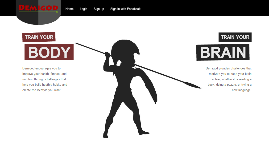
Demigod's home page
Additionally, we worked on the profile page (this is the first page that users will see once they sign in), whose design is almost completed. We changed the default avatar picture by using the same silhouette as in the home page (with some minor changes). This kind of customizations usually do not take too much time and they improve considerably the User Experience, which is actually the main goal of a good design. Finally, Natalie and I worked on the progress bar by editing the style in order to match with the rest of the website. Moreover, we changed the color combination in the CSS file and adjusted some align parameters. I personally like the effect of the green color in the progress bar.

Demigod's profile picture
Along this week, we will keep working on the design, as most of the functionality is already completed and we need to improve the User Experience.
Saturday, April 5, 2014
Sixth client meeting reactions
We are already more than half of the project, and last Wednesday we had our sixth client meeting, this time with Nikan. Since we arranged in class, in the rest of the meetings, our client will alternate between Nikan and Professor Ackley.
We started the meeting showing a new demo to Nikan. It included some features that we had already presented to Ackley in the last meeting, as well as new improvements in which we were working the last week. More specifically, the demo contained the following features:
We started the meeting showing a new demo to Nikan. It included some features that we had already presented to Ackley in the last meeting, as well as new improvements in which we were working the last week. More specifically, the demo contained the following features:
- Facebook login. Users will be able to sign in using either their Facebook credentials or their Demigod account (assuming they have signed up previously).
- Challenge simulation: Progress bar with check-ins per week constraint and 20 seconds per day simulation.
- Share on Facebook once the user success a challenge.
- Access to the online version through a purchased domain name.
- Drop-down menu labeled with the username. It is located on the top bar (top-right), and includes the following buttons: "Logout", "Edit account" and "My challenges".
- Home page layout Beta design (We are currently working on the home page design and logo, so we actually showed just a Beta version with the color pattern chosen, font families and sizes, etc.).
- Home page demo (functionality)
- "My Challenges". New page where the users will be able to check their created challenges organized by category. Additionally, each row of the table displays the name, description and number of points of each challenge. This page is currently under construction, because we planned to display a random selection of 10 challenges for each category (physical, nutritional and intellectual) in order to avoid scrolling and low resolution issues. But there will be available a "View all" button to get the full list.
- Create a new challenge (showed in the previous meeting): Users can create their own challenges. They will have to add the name, description, number of check-ins per week, number of weeks (duration), stats affected (nowadays we have a provisional list of 6 dimensions, but we are going to review it), and finally the category. A 20 points score will be assigned automatically to the new user's challenges, and only the administrators will be able to select the number of points for any challenge.
- Challenge completion: Once a challenge is completed, the stats indicators in the profile page are updated by adding an extra level to the affected stats. Thus, there is no way to increase more than one level per statistic when you success a challenge.
Client reactions:
- Nikan suggested using little progress bars instead of counters to display the stats.
- Share challenge points on Facebook?
- Nikan also had the opportunity to try the demo. She noticed that there was a bug in the new drop-down menu , because it did not work properly in some point when refreshing the page (we need to find a workaround for this weird bug).
- Home page looked "proffessional", but the profile page needs more design. We have to implement the layout: clean design, as few words as possible, clean text, smart buttons, unifying styles.
- Add the avatar picture to Facebook sharing posts?
- She liked our demo, because it included all the functions we had on our timeline so far.
- Marketing should be an important part of our project.
- "Demigod is a very good application and the demo was right".
Next action: Basically three tasks:
- Improve performance (Matt S.)
- UX (Matt F.)
- Design (Fernando, Natalie & Matt F.)
Wednesday, April 2, 2014
Git: Pulling specific directories or files
Recently I had an issue when working on Demigod's project. I do not know the reason, but I did not have all the stylesheet files which should be included in the /app/assets/stylesheets/ folder. The first workaround I tried was to pull all the changes from our remote repository, just in case other member of the team would accidentally have moved those files. The remote repository had all the files (I checked it through Bitbucket website), but no changes occurred on my local repository when I run a git pull command on the Rails console. I did not understand what was happening, but I needed those files on my local repository.
I did a quick research on the Internet, I found a solution to solve my issue. There exists a way to pull only specific directories or files. As I commented on my last post, git pull fetches and merges the remote branch, but we can use the "fetch" command, that also fetches the remote branch, but, additionally, extracts the directory or file you need from that branch by a checkout operation. Therefore, you actually need two operations, first a "fetch" to download the objects from the repository, and then, a "checkout" to update the files/directories in the working tree and match the version in the specified path:
> git fetch <remote> <branch>
> git checkout <remote>/<branch> -- relative_path_to_file_or_directory
In my case, we had to run the following code in order to update the "stylesheets" directory:
> git fetch origin master
> git checkout <remote>/master -- .app/assets/stylesheets
After running the previous commands, my local "stylesheets" directory was updated with all the files included in the same folder of the remote repository. If you need just a specific file, you can also select that file inside the folder, for example:
> git checkout <remote>/master -- .app/assets/stylesheets/home.css.scss
Problem solved!
Monday, March 31, 2014
Git pull tips
My project team is using Git (Open Source software) as a version control system to handle all the changes we made in the code. This software, combined with Bitbucket, a free code-hosting service, makes a really powerful tool which makes life easier (at least the programmer's life).
> git status
If the pulling operation was successful, the console will show a message "no things need to be merged", otherwise, it will display an "unmerged" message, and you will have to decide what changes you want to keep by editing each one of the files listed. When all the files are merged (check it by typing again "git status" command), we would have our local repository already updated. Although it is also recommended to run two more commands:
When we want to pull all the changes from the remote repository, we use the general pattern for the "pull" command:
> git pull [options] [<repository> [<refspec>...]]
> git pull [options] [<repository> [<refspec>...]]
The "standard" way to pull the remote repository is by typing:
> git pull
This fetches and integrates the remote repository with your local repository or local branch. However, a stashing operation before pulling is strongly recommended in order to avoid merge conflicts with not-done work (code tasks in progress). Git documentation defines the stashing operation as the one that "takes the dirty state of your working directory — that is, your modified tracked files and staged changes — and saves it on a stack of unfinished changes that you can reapply at any time." Then, we should type:
> git stash
> git pull
After these two consecutive operations, we can easily check if there exists something to be merged by using the "status" command:
> git status
If the pulling operation was successful, the console will show a message "no things need to be merged", otherwise, it will display an "unmerged" message, and you will have to decide what changes you want to keep by editing each one of the files listed. When all the files are merged (check it by typing again "git status" command), we would have our local repository already updated. Although it is also recommended to run two more commands:
> bundle install
Bundle install all the dependencies you need (gems from your specified sources). This is interesting to avoid issues if somebody changed any code in the Gemfile from the remote repository.
Finally, other useful way to keep the consistence of our application is related to possible migrations, so do not forget to run:
> rake db:migrate
This will run any migration stored in the /db/migrate/ folder.
In my next post, I am going to talk about how to pull an specific folder when using Git.
Saturday, March 29, 2014
Fifth client meeting reactions
Yesterday, we met with professor Ackley in our fifth client meeting. We kept in mind the last time we tried to show a demo to Ackley (third client meeting), when we were not able to show the model properly because of a clear lack of preparation. Fortunately, we learnt from our mistakes and the past week we showed a decent demo to Nikan. As Ackley had not seen any proper demo, it was our chance to demonstrate that we had already most of functionality working.
As usual, we started the meeting with the last week task report. No problems in this sense, because all the members of the team were able to complete their tasks due to before the client meeting. Then, we spent almost all the rest of the meeting showing the demo. Last time, we used my laptop to present our demo. It actually worked fine, but since I am running Rails on an Ubuntu installation inside a Virtual Machine (VirtualBox), the screen resolution features are not as good as in a regular installation. This caused some minor visualization issues when we ran the demo using Firefox browser. Therefore, this time we decided to use Natalie's Macbook laptop in order to avoid this kind of problems that could worsen the user's experience.
Again, the Demigod's demo was really good because we were able to show all the functionality that were working properly so far. As we were working most of the time focused on the functionality rather than on the design, the demo looked not as pretty as we liked, but the main goal right now is that the application works fine, and then, we will address the style and design stuff.
Even though we did a great job showing the demo, Ackley made some comments about our application, such as:
- The Index page may include a kind of animated carousel.
- Profile page: show the user’s name instead of the email. Include the username and a logout button on the right side of the navigation bar, as usual on this kind of websites.
- A small picture of each challenge may be added. Also applied for the different categories of challenges.
- He suggested using always the same name to define a "Check-in", instead of things like “Success”.
- Fail button should include a confirmation dialog (“Are you sure?”)
- What the points really mean? Points distribution: Can you distribute the points in different dimensions?
- Statistics and challenges page need better design...
- On the way encouragement when you log in (motivation quotes or something similar)
- Decide the final list of challenges.
- Was the maximum number of check-ins per week (7) our choice?
- He also suggest starting to think about the final demo of our project.
However, it seems Ackley liked our demo, and he said that his less concern about our project so far is about the functionality. This sounded like "Ok guys, let's focus on the design", but we still have to deal with some functionality features. Anyway, we are going to start working on the design the next week.
Wednesday, March 26, 2014
Guest speaker in class
Last Monday, the founder of Vandyke Software visited our class and talked to us about how software is developing in the real world. He explained that every day, they follow the same pattern when we work on a software project:
- Feature requests, bug reports
- Feature requests, bug reports
- Test track (database)
- Acceptance tests (light-weight process. No database needed. It includes conversations between developers and project managers)
- Iteration planning (Poker estimates, 1 hour/day in average)
- Story, stories (Theme)
- Task estimates (developers & project managers)
- Buffer (Were the estimates good enough?)
- Fudge factor (Measure how good were the estimates)
- Iteration
- Bootlog Friday (Relieve value)
- Commit (Smaller code chunks are usually better)
- QA (If the code does not pass the tests, send back to developers as soon as possible)
He spoke about the iteration planning, focusing on the Poker estimates. They are basically a way to estimate the effort needed to achieve a goal when working on a software project (how long this task/problem will take?). If there is not a clear idea about the the task duration estimate, it is a good idea to divide the problem is smaller problems, because they will definitely be easier to measure. In terms on task estimates, he said that developers can only make rough estimates, but project managers are able to do more accurate estimates because they have the project's budget. Anyway, it is always better for all the members of the team to divide tasks in smaller chunks in order to estimate times, although the average task duration should be between 4 and 8 hours.
Moreover, from the point of view of Vandyke, the stories based on a theme (basically a request that has been already received previously) should be splitted (again the same approach) into two or three weeks in order to get something more valuable at the end. He also talked to us about code committing and the difference between his expectation and the reality, because, ideally, developers should commit code ready to be submitted, however, about the 50% of the committed code comes back to developers after being tested by QA. Regarding how to commit the code. Vandyke explained that sometimes is very difficult for developers to commit small code portions, but they should try to do it, because if a bug comes up, it will be easier and faster for the rest of the team to find out where the issue is.
He also referred several times to a book named "Extreme programming explained: embrace change", which he recommended for all the developers interested in software engineering.
Monday, March 24, 2014
Generating a new scaffold in Rails
Recently, Natalie and I had other programming session in which we decided to create a new structure in order to get an easier way to deal with the check-ins interval. This had to be done by splitting the challenge's duration in weeks (instead of considering the whole duration) to keep track of the check-ins made by the user.
We essentially required to create a new Rails model that actually could be directly generated through the Rails console. But instead of using that method, we decided to setup up a scaffold, a tool provided by Rails which helps programmers create structures such as views, models and controllers for a new resource, but only in a single operation. In this case, we had to create a new model, so thanks to the scaffolding method, we were able to do it easily by using the following pattern :
rails g model <model_name> <field_1:type> <field_2:type> … <field_n:type>
The previous command generates a new table in the database with the specified fields and data types. In our case, the model was called "week", and it contained three fields:
rails g model week start_week:datetime end_week:datetime checkins_completed:boolean
Rails console creates the migration file in /db/migrate/ folder, by labeling it with the common patter: <current_date>_create_<model_name>.rb. Rails also executes this migration in our repository, thus, Rails creates the model itself (weeks.rb) in the ./project_name/app/models/ folder, as well as the rspec file (spec/models/week_spec.rb) and the factory file (spec/factories/weeks.rb)
Once we had the new table, we added the current data from other tables (relations) into the new table by following this convention (creating a new migration file):
rails g migration Add<source_field_name1>And<source_field_name2>And<source_field_name_n>To<destination_table> <destination_field_name1>:<type> <destination_field_name2>:<type> ...<destination_field_name_n>:<type>
Note that you need to apply the previous code separately for each one of the tables you want to get any field.
For example, we created two migration files, one per each table of the database we dealt with:
rails g migration AddUserIdAndUserChallengeIdAndCheckinsToWeek user_id:integer user_challenge_id:integer checkins:integer
rails g migration AddWeekIdToHistory week_id:integer
We edited the generated migration files adding the proper information to the new table. For example, this was the code for the Week table:
create_table "weeks", force: true do |t|
t.datetime "start_week"
t.datetime "end_week"
t.boolean "checkins_completed"
t.datetime "created_at"
t.datetime "updated_at"
t.string "user_id"
t.integer "user_challenge_id"
end
Finally, Natalie and I added the active record associations (in our particular case, "belongs_to" and "has_many" associations) into the model files (history.rb and week.rb), and we executed a rake db:migrate command in order to apply all the changes in our local repositories.
Sunday, March 23, 2014
Migrations in Ruby on Rails
Last week, Natalie and I continued working on the progress bar. In order to keep track of the challenges that the user have succeed, we decided that we need to add a new field to the database. This new boolean field had to be added to the user challenges table, and was called "finished". We looked for some documentation, and we figured out that there was a kind of migration "convention", which is used each time you want to make changes in a database.
The first step was to create the new column in the database by typing in the RoR console (Rails c) a command that follows this pattern:
rails g migration add_<new_field_name>_to_<table_name> <new_field_name>:<type>
If we need to delete a column, we should use the same format, but switching "add" by "remove":
rails g migration remove_<field_name>_from_<table_name>
Returning to our particular case, the command used was:
rails g migration add_finished_to_user_challenges finished:boolean
This command creates a new .rb file in the migrations folder, located at your_project_folder/db/migrate/. It is labeled with the current date following by the same name as we wrote the previous command. For this reason, it is very important to use the convention that I commented on the first paragraph.
Thus, we edited the new migration file, by creating a new class that generates the new field:
class AddFinishedToUserChallenge < ActiveRecord::Migration
def change
add_column :user_challenges, :finished, :boolean, default: false
end
end
Moreover, we also decided to edit an existing field in the same table (user_challenges) and the histories table. This time, we needed to change the data type of the "duration" field, because it was created as an integer. As it was calculated by multiplying the number of times per week that the user have to check in and the number of weeks of the challenge, and we divided that value by 100 to get a progress bar percentage, the value was eventually rounded causing accuracy issues. Therefore, Natalie and I changed the "duration" field type from integer to decimal, following this format:
rails g migration change_data_type_for_<field_name>_in_<table_name>
Applying the previous pattern to our case:
rails g migration change_data_type_for_progress_in_user_challenges
rails g migration change_data_type_for_progress_in_histories
After creating the migration files, the next step was to define the class in both files to define the migrations:
class ChangeDataTypeForProgressInUserChallenge < ActiveRecord::Migration
def change
change_table :user_challenges do |t|
t.change :progress, :decimal
end
end
end
Finally, Natalie and I executed a rake db:migrate command to apply the changes specified in the migration files. Thanks to this approach, we committed all the new files and the rest of the members of the team were able to pull this files, getting the same changes immediately.
- More information about migrations on RoR
Thursday, March 20, 2014
Fourth client meeting reactions
We had our fourth client meeting last Friday with Nikan, as we are switching our client (Nikan <-> Ackley) every week. This time, there was a new way for us to face a meeting, because we had to plan the agenda of the meeting. All the points to discuss were up to us.
At the beginning, it may seemed as a benefit for the team, because you can actually divide the time (25 minutes) as you want, focusing on the parts you prefer to discuss or showing a demo to your client. You actually take the control over the meeting, and you are able to choose the points that you want to deal with. This way may be seen as an advantage, but sometimes it could be tricky especially if you do not distribute your time correctly, because you have to be able to control the meeting's flow by distributing the time. Hence, if you want to success, keep in mind that you need to plan the meeting in advance, and then, fit your meeting's agenda as you planned.
For this reason, we decided discussing about the schedule before Friday's meeting. As we had certain parts of the functionality already running, we decided focus the meeting on showing Nikan a model with the progress since we start working: user registration and sign in process, avatar upload, challenge selection page, current challenge progress bar (I have been working on it with Natalie for several weeks), new challenges creation, etc.
Although we wanted to spend most of the time available showing the demo, we began the meeting with a brief review over the tasks done the previous week. In the meantime, we have fulfilled the timeline and all the weekly tasks have completed by each team member. After that, we went through the Demigod demo. Note that in the last meeting we made a mistake when we tried to show a demo to Ackley, but fortunately we learned from our mistakes, and this time we brought a laptop with a Rails server running and the website ready to be displayed.
The demo was introduced by Matt, who clearly explained each functionality which was already working properly as well as showed several suggestions and tests suggested by Nikan. We felt that she was really satisfied with our work, and she actually congratulated us for our progress. Moreover, I think we made a great control of the time, because once we ended the demo we still had five minutes left to identified the tasks we need to accomplish due next meeting (after the Spring Break).
From my point of view, this was the most successful client meeting so far. We hope the next one be even better since we are working hard to have all the Demigod's functionality ready as soon as possible.
Monday, March 17, 2014
Demigod: How to avoid cheating when check-in using jQuery and Ruby
Natalie and I have worked on the challenges progress bar. The number of check-ins needed to success the challenge depends on two variables whose combination gives its duration (or number of total check-ins needed): the number of check-ins per week, and the number of weeks. So, if we select a challenge requires 2 check-ins per week during 4 weeks, the duration is going to be 8 check-ins. Taken into account the previous statement, the main problem is how to control user's cheating when check-in, because if we do not control it, a user could check-in continuously, succeeding the challenge in few seconds.
The idea was to simplify the problem and then, trying to apply to a real situation. To do this in a simple approach, we thought that the easiest way was to prevent check-ins in the first minute since the user picks a challenge. We needed to disable the "Success" and "Fail" buttons during one minute, and then, enable both of them. We focused on the user's challenge partial file, one of the files we have in the views/users/ folder (Ruby on Rails).
The first variable we need is the current progress for the selected challenge, which we retrieved from the instance variable in the users controller (*.rb). Note that we added Ruby code inside the jQuery function using the proper syntax: #{ruby_code}:
var progress = #{@current_progress};
We created a new function called isValidCheckin which receives the current progress and basically checks the time that has passed since the first time stamp in the database associated to that pair challenge-user (we use an history table to store this information). Therefore, the function either enables or disables the "Success"/"Fail buttons depending on the time time between the first time stamp and the current time. Because of testing reasons, we set this time to 1 minute delay:
function isValidCheckin(progress){
var startTimestamp = "#{@start_timestamp}";
var difference = "#{(Time.now - @start_timestamp.to_time)/1.minute}";
console.log("Difference: " + difference);
if(difference > 1 && progress < 100){
$('#successBtn').removeAttr("disabled");
$('#failBtn').removeAttr("disabled");
}
else {
$('#successBtn').attr("disabled","disabled");
$('#failBtn').attr("disabled","disabled");
}
}
To get the number of minutes that have passed since the first time stamp, Ruby has a very useful function: number.minute/day/hour/year... In this case, we used 1.minute, that gets the number of minutes. Having this value stored in the "difference" variable, we checked if it is greater than 1 minute, and if the challenge is not completed yet, we enabled both buttons, otherwise, we disabled them.
Natalie and I started by initializing the buttons, because the user could refresh the page or even log out and log in again. Anyway, if the current challenge is not started yet (progress = 0) or it is done (progress = 100), we had to avoid check-in by disabling both buttons with the "attr" jQuery property. Else, if the challenge is in progress, the buttons must be enabled (jQuery property "removeAttr"):
if ((progress >= 100) || (progress == 0)){
$('#successBtn').attr("disabled","disabled");
$('#failBtn').attr("disabled","disabled");
}
else if (progress > 0 && progress < 100){
//enable buttons
$('#successBtn').removeAttr("disabled");
$('#failBtn').removeAttr("disabled");
}
After this piece of code, we called the function to check the time:
isValidCheckin(Progress);
We also added some "breakpoints" to check the variable values on the browser's console. This can be easily done by writing the console.log(variable_name), for example:
console.log("Challenge progress: " + progress);
console.log("Difference (min): " + difference);
In order to test the code, we picked a random challenge and then, we checked the Firefox's console, that showed these messages:
 As the challenge was not started, the progress is 0, and the difference en minutes since the challenge started was just a few seconds., the outcome showed on our browser was a disabled "Success" button:


Now, the difference is more than 1 minute, so we were able to check in:

The next step is to convert this code to do the same function when the minimum time needed to wait between check-ins depends on the challenge's duration, as I told in the first paragraph.
The idea was to simplify the problem and then, trying to apply to a real situation. To do this in a simple approach, we thought that the easiest way was to prevent check-ins in the first minute since the user picks a challenge. We needed to disable the "Success" and "Fail" buttons during one minute, and then, enable both of them. We focused on the user's challenge partial file, one of the files we have in the views/users/ folder (Ruby on Rails).
The first variable we need is the current progress for the selected challenge, which we retrieved from the instance variable in the users controller (*.rb). Note that we added Ruby code inside the jQuery function using the proper syntax: #{ruby_code}:
var progress = #{@current_progress};
We created a new function called isValidCheckin which receives the current progress and basically checks the time that has passed since the first time stamp in the database associated to that pair challenge-user (we use an history table to store this information). Therefore, the function either enables or disables the "Success"/"Fail buttons depending on the time time between the first time stamp and the current time. Because of testing reasons, we set this time to 1 minute delay:
var startTimestamp = "#{@start_timestamp}";
var difference = "#{(Time.now - @start_timestamp.to_time)/1.minute}";
console.log("Difference: " + difference);
if(difference > 1 && progress < 100){
$('#successBtn').removeAttr("disabled");
$('#failBtn').removeAttr("disabled");
}
else {
$('#successBtn').attr("disabled","disabled");
$('#failBtn').attr("disabled","disabled");
}
}
To get the number of minutes that have passed since the first time stamp, Ruby has a very useful function: number.minute/day/hour/year... In this case, we used 1.minute, that gets the number of minutes. Having this value stored in the "difference" variable, we checked if it is greater than 1 minute, and if the challenge is not completed yet, we enabled both buttons, otherwise, we disabled them.
Natalie and I started by initializing the buttons, because the user could refresh the page or even log out and log in again. Anyway, if the current challenge is not started yet (progress = 0) or it is done (progress = 100), we had to avoid check-in by disabling both buttons with the "attr" jQuery property. Else, if the challenge is in progress, the buttons must be enabled (jQuery property "removeAttr"):
if ((progress >= 100) || (progress == 0)){
$('#successBtn').attr("disabled","disabled");
$('#failBtn').attr("disabled","disabled");
}
else if (progress > 0 && progress < 100){
//enable buttons
$('#successBtn').removeAttr("disabled");
$('#failBtn').removeAttr("disabled");
}
After this piece of code, we called the function to check the time:
isValidCheckin(Progress);
We also added some "breakpoints" to check the variable values on the browser's console. This can be easily done by writing the console.log(variable_name), for example:
console.log("Challenge progress: " + progress);
console.log("Difference (min): " + difference);
In order to test the code, we picked a random challenge and then, we checked the Firefox's console, that showed these messages:
1 minute after we picked the challenge, we refreshed the browser, and again, we checked the console:
Now, the difference is more than 1 minute, so we were able to check in:
The next step is to convert this code to do the same function when the minimum time needed to wait between check-ins depends on the challenge's duration, as I told in the first paragraph.
Saturday, March 15, 2014
User experience: influencing customer decisions
In the last lecture, we discussed about the user experience (UX). According to Wikipedia, it involves a person's behaviors, attitudes, and emotions about using a particular product, system or service. The last three words of this definition mean that UX is not only applied to software development, but also to any product. Anyway, we are going to focus on this term from the point of view of software engineering.
Based on my previous experience as a freelance web designer, I had the opportunity of dealing with several customers and different projects. In general, I noticed that most of the customers get carried away by my recommendations, especially in terms of design and style (always respecting the corporate identity). It is very important to identify as quick as possible if our clients have a clear idea about what they want when you face a software project. It requires attention to detail, and some experience in client meetings. Furthermore, you also need to display strong communications skills, because most of the UX is not so much about applying the right methodologies or being an outstanding designer, it is more about properly communication with your customer. Regarding this fact, I think that the main goal is to know how to persuade or influence your client in some way that involves taking significant decisions or making changes based on your own recommendations. It may sound "unethical", but is the way followed by many UX engineers (whenever possible) to get the best results, and I can confirm that it works with most of the customers. It seems like they feel more confident when they get advice from a professional who is used to work/design similar things (such as a website, software, hardware, etc).
In addition, it is always a good practice letting external users be part of the project somehow. They should be familiar with the technology you are working on, but only in terms on usability if possible. This practice is widely used during the test stage (also called "beta testers"), but I think that external users can collaborate with the project almost from the beginning. For example, they may give their point of view about the story board (design stage), because they actually do not need experience or skills in software development. Following this approach you can get quick benefits based on their UX, because it is very common that designers and programmers overlook certain mistakes or improvements that could be easily fixed. That is the reason why a "third party point of view" may be so interesting particularly in software development.
Subscribe to:
Posts (Atom)