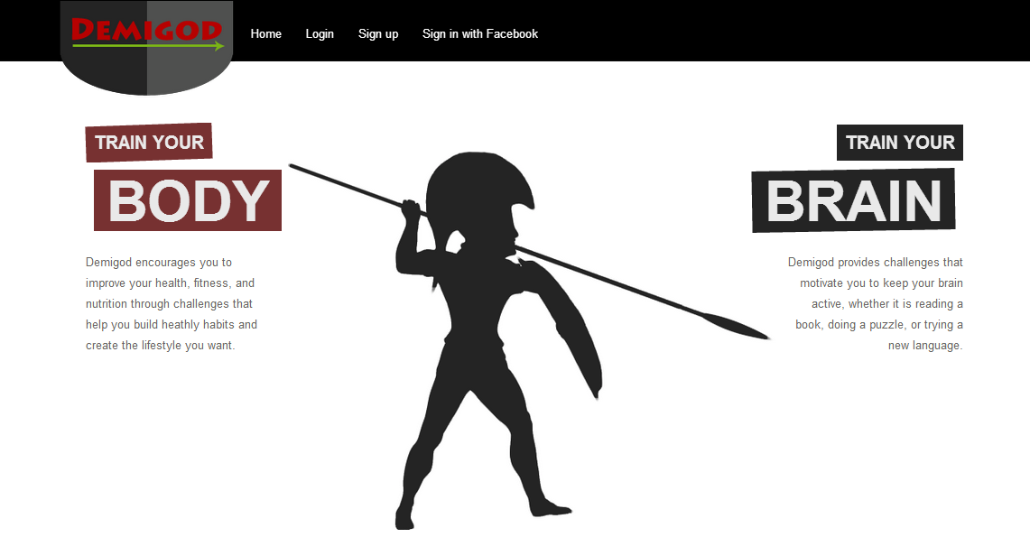
Last Saturday, Natalie and I had a new coding session to continue working on the Demigod's design. The home page is not complete yet, but it seems that we finally found the color pattern for the whole website. This is going to be a mixture of black, dark red and a bright green. We needed a pattern which transmits "a sense of challenging" in some way, and fortunately all the team agreed with the color selection.
We also did some modifications in the Demigod's logo, because of a slightly lack of contrast with the background, but finally it looks fine, and we believe that it represents the challenging approach of the application. In this sense, we added a silhouette of a Greek soldier in the middle of the page, which, from my point of view, improves the design and fits somehow with the goals of the website.
Demigod's home page
Additionally, we worked on the profile page (this is the first page that users will see once they sign in), whose design is almost completed. We changed the default avatar picture by using the same silhouette as in the home page (with some minor changes). This kind of customizations usually do not take too much time and they improve considerably the User Experience, which is actually the main goal of a good design. Finally, Natalie and I worked on the progress bar by editing the style in order to match with the rest of the website. Moreover, we changed the color combination in the CSS file and adjusted some align parameters. I personally like the effect of the green color in the progress bar.
Demigod's profile picture
Along this week, we will keep working on the design, as most of the functionality is already completed and we need to improve the User Experience.


No comments:
Post a Comment